Home Practice
For learners and parents For teachers and schools
Textbooks
Full catalogue
Leaderboards
Learners Leaderboard Classes/Grades Leaderboard Schools Leaderboard
Pricing Support
Help centre Contact us
Log in

We think you are located in United States. Is this correct?

2.1 Introduction and key concepts

2.3 Linear patterns, relationships and graphs (EMG3C)

We have looked at some ways in which two quantities relate to each other. and we have seen how the whole message can be shown on a graph. Two quantities often relate to each other in a way that forms a clear pattern. The next two sections deal with these patterns in table and graph form.

The second and third sections in Chapter 2 deal with patterns and showing the patterns in both tables and graphs.

First let learners practise plotting points on a grid, and make sure that they all understand that the first coordinate is plotted from the horizontal axis and the second coordinate from the

vertical axis, as in the first Worked example in this unit.

Plotting points on a grid (EMG3D)

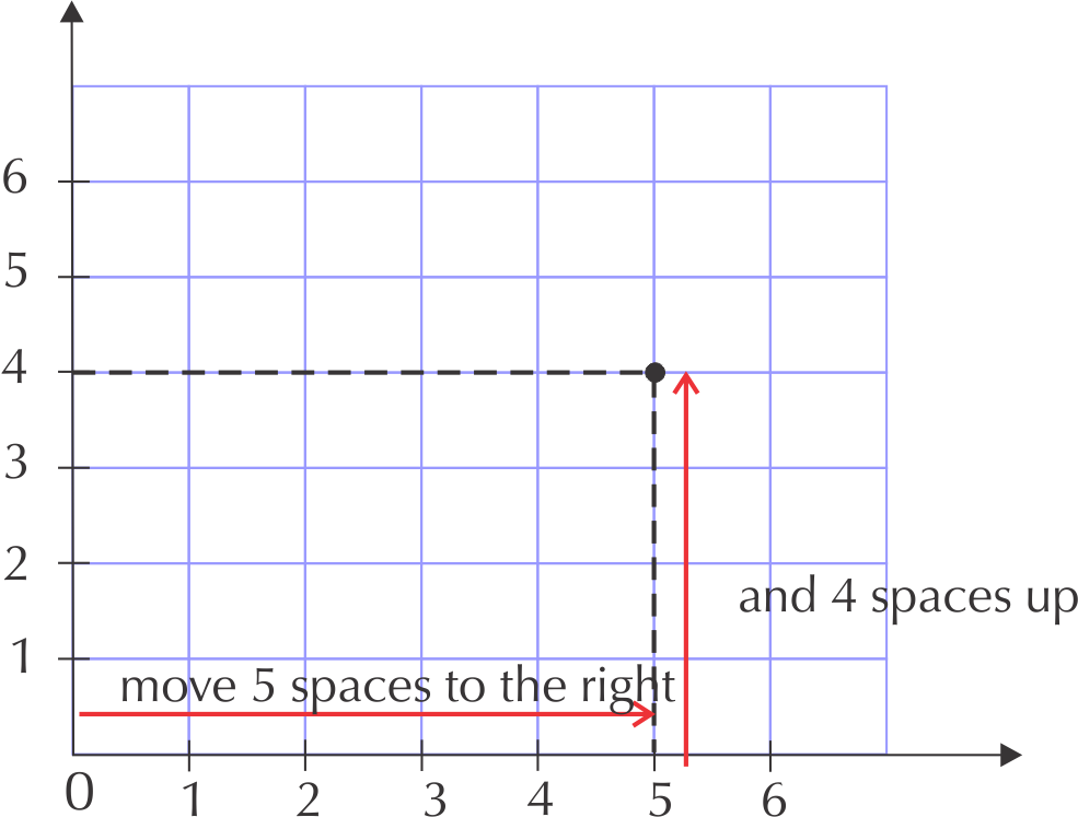
Plotting points means that we need to plot the values of an ordered pair. An ordered pair gives us the exact position on a grid, for example: (\(\text{5}\); \(\text{4}\)). That the first number in an ordered pair is the horizontal coordinate and the second number is the vertical coordinate:

(horizontal; vertical)

Method:

To plot the point representing the ordered pair (\(\text{5}\); \(\text{4}\)):

1. Start at the origin (\(\text{0}\); \(\text{0}\)).

2. Move along the horizontal \(x\)-axis until you reach \(\text{5}\).

3. Move upwards until you are in line with \(\text{4}\) on the vertical \(y\)-axis.

4. Draw a dot whether the grid lines cross.

Ordered pair
Two numbers written in a particular order so that they give the location of a point on a grid. an ordered pair is also known as a coordinate pair.

Worked example 4: Plotting points

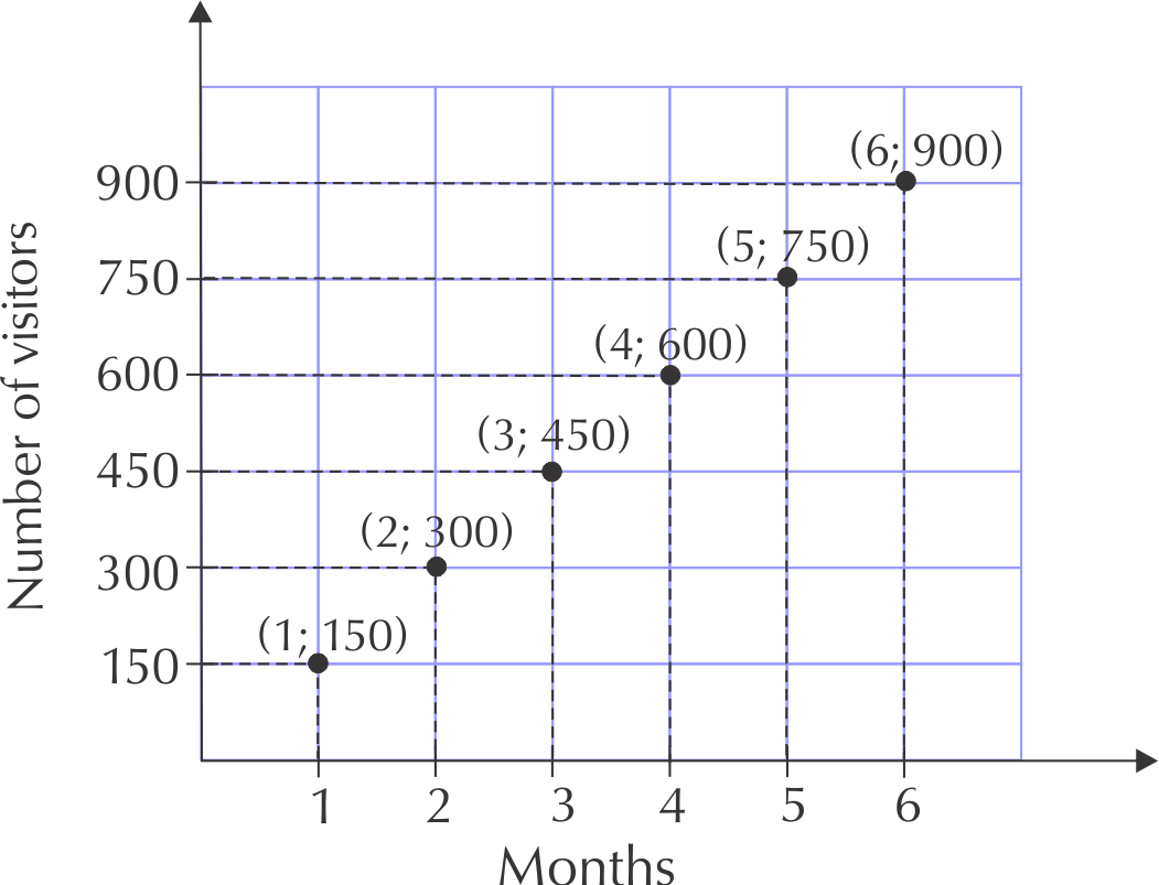
The number of visitors to a new museum increases by \(\text{150}\) visitors each month for \(\text{6}\) months.

Month

\(\text{1}\)

\(\text{2}\)

\(\text{3}\)

\(\text{4}\)

\(\text{5}\)

\(\text{6}\)

Number of visitors

\(\text{150}\)

\(\text{300}\)

\(\text{450}\)

\(\text{600}\)

\(\text{750}\)

\(\text{900}\)

  1. Write down a set of ordered pairs for this relationship.
  2. Plot the points on a graph grid.
  3. Would you connect the points with a solid line? Explain.
  4. Which quantity is the dependent variable, and which is the independent variable? Explain your answer.
  1. From the table, we get the following list of ordered pairs: (\(\text{1}\); \(\text{150}\)) (\(\text{2}\); \(\text{300}\)) (\(\text{3}\); \(\text{450}\)) (\(\text{4}\); \(\text{600}\)) (\(\text{5}\); \(\text{750}\)) (\(\text{6}\); \(\text{900}\))
  2. For each point we start at the origin, move across the horizontal \(x\)-axis to find the first number and move up the right number of spaces on the vertical \(y\)-axis to find the next number, then draw a dot to plot the point.

  3. The points should not be connected by a solid line, because the values are discrete (there are no possible values in between them).
  4. The month is the independent variable and the number of visitors is the dependent variable, because the number of visitors increases each month.

Linear relationships and graphs (EMG3F)

Some relationships between quantities give patterns that form linear graphs. How do we recognise a linear relationship?

A linear relationship forms a straight line when the points are plotted.

Linear relationships

Exercise 2.2

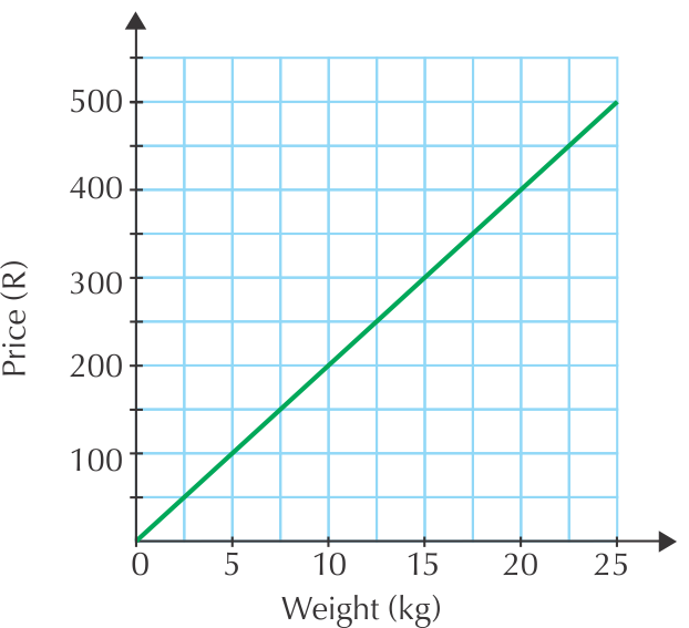
This graph shows the cost of potatoes per weight.

Using the above graph, complete the table showing the same relationship:

Weight of potatoes (kg)

\(\text{5}\)

\(\text{10}\)

\(\text{15}\)

\(\text{20}\)

\(\text{25}\)

Cost (R)

\(\text{100}\)

\(\text{400}\)

\(\text{600}\)

Weight of potatoes (kg)

\(\text{5}\)

\(\text{10}\)

\(\text{15}\)

\(\text{20}\)

\(\text{25}\)

\(\text{30}\)

Cost (R)

\(\text{100}\)

\(\text{200}\)

\(\text{300}\)

\(\text{400}\)

\(\text{500}\)

\(\text{600}\)

What will 7,5 kg of potatoes cost? Read this from the graph.
\(\text{R}\,\text{150}\)
If you spend \(\text{R}\,\text{300}\), what is the weight of potatoes you have bought?
\(\text{15}\) \(\text{kg}\)
Identify the independent and dependent variables on the graph.
Weight is the independent variable. Price is the dependent variable.

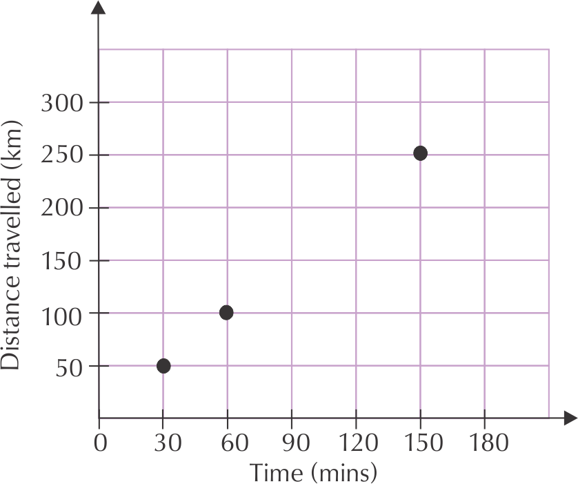
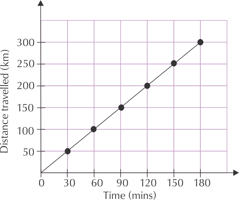
The relationship between the distance that a car travels and the time it takes is shown in the table below.

Distance travelled (km)

\(\text{0}\)

\(\text{50}\)

\(\text{100}\)

\(\text{150}\)

\(\text{200}\)

\(\text{250}\)

\(\text{300}\)

Time (minutes)

\(\text{0}\)

\(\text{30}\)

\(\text{60}\)

\(\text{90}\)

\(\text{120}\)

\(\text{150}\)

\(\text{180}\)

Copy and complete the graph of distance travelled against time, using the values in the table.

Write down the speed of the car in kilometres per hour.

\(\text{100}\) \(\text{km}\) per hour.

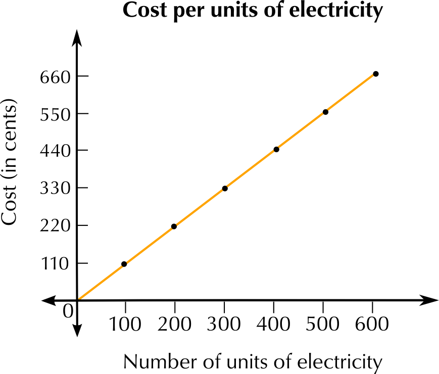
This table shows the amount of money that a municipality charges for the amount of electricity that a household uses.

Number of units of electricity

\(\text{0}\)

\(\text{100}\)

\(\text{200}\)

\(\text{300}\)

\(\text{400}\)

\(\text{500}\)

\(\text{600}\)

Cost (cents)

\(\text{0}\)

\(\text{110}\)

\(\text{220}\)

\(\text{330}\)

\(\text{440}\)

\(\text{550}\)

\(\text{660}\)

Where will the graph start? Explain how you know this.

at \(\text{0}\) units and \(\text{0}\) cents, at the intersection of the horizontal and vertical axes. We know this because we are given the minimum values, where both variables are equal to zero.

Plot a graph using these values.

Why is this graph continuous (there are no gaps between the points)?

Because every number of units of electricity used will be charged for. There is no quantity of electricity usage which does not have cost.

We say that the cost depends on the number of units of electricity used. Explain why this is. What pattern do you see in the table?

Cost increases as the number of units of electricity increases. The more electricity is used, the more you have to pay.

Is this graph going up (increasing), going down (decreasing) or staying the same (constant)? Give a reason for your answer.

The graph is increasing. It has an upward slope, that indicates that the cost per unit increases as the number of units used increases.